Veridian Credit Union Brand Guidelines
Identity
The Veridian Credit Union logo should only be reproduced in the following three ways:
Download logo files

Clear space requirements
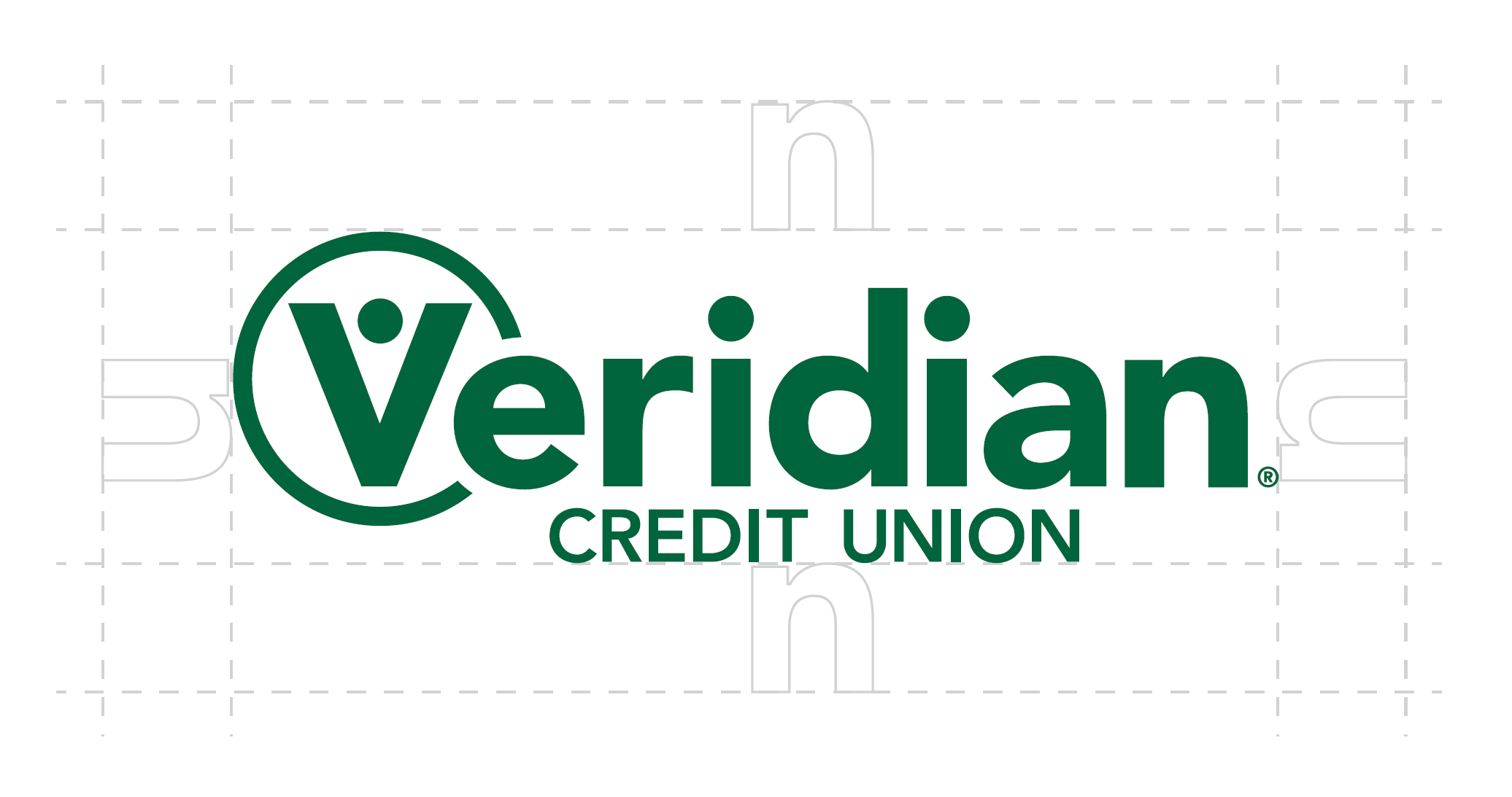
To preserve the integrity of the Veridian Credit Union logo, always maintain the minimum clear space around the logo. The clear space protects the Veridian Credit Union logo from all other graphic elements such as logos, copy, photographs, or background patterns that may distract the viewer's attention. Clear space equal to or greater than the height of the "n" used in the Veridian Credit Union logo should always be maintained. Remember the "n" space also applies to the distance between the Veridian Credit Union logo and any edge of the page.
Brand personality, tone and voice
When writing copy for Veridian, it’s important to use a consistent style that is informative, positive, professional and empathetic. Always keep the individual you are writing to in mind. Don’t presume they know what you’re talking about. Our messaging should feel like a friendly conversation with a teller.
The tone of all communication should be:
- optimisitic
- empathetic
- relatable
Imagery

Photos and video can feature one or more persons. Images can be cropped in various ways, ranging from tight, head-and-shoulder shots to half-length or full-length body shots.
Photos should feel authentic and real, representing the diverse individuals to whom we provide services. This means there are no limitations on race, weight, or socioeconomics.

These images and video assets can sometimes take more effort to find, but they can give the brand persona an exciting twist and help tell our story in a more compelling way.

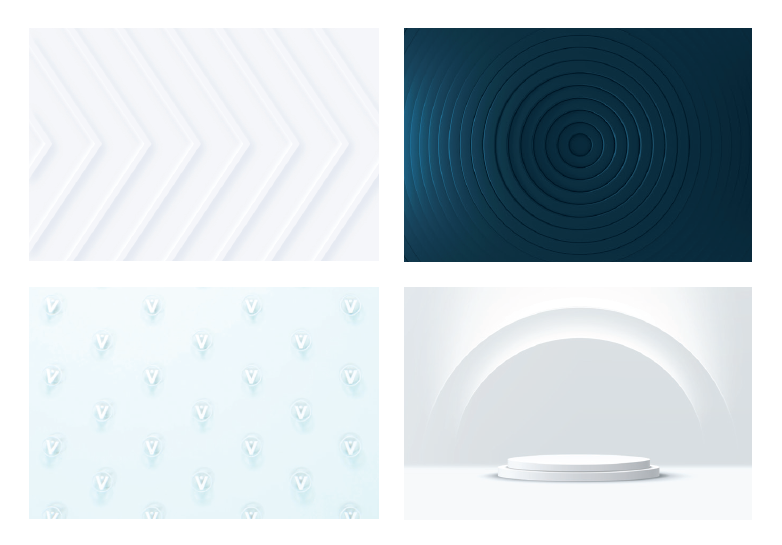
A little more abstract in concept, these 3D images and videos provide the brand with unique and ownable visual assets.
View our full Brand Guide to learn more about photography and framing of images as it relates to our brand.
View Brand GuideColor Palette
Our brand colors consist primarily of green and blue hues. These colors are designed to convey a sense of calm and call to mind the ease one feels when using our products and services.
Corporate Green
PMS 3425
CMYK 90, 35, 81, 27
RGB 0, 103, 71
HEX #006747
Mid Green
CMYK 80, 12, 74, 1
RGB 31, 160, 110
HEX #20A06E
Light Green
CMYK 23, 5, 31, 0
RGB 192, 214, 186
HEX #C0D7B9
Dark Blue
CMYK 94, 62, 44, 28
RGB 18, 76, 97
HEX #124C61
Mid Blue
CMYK 83, 43, 16, 1
RGB 37, 125, 171
HEX #257DAB
Light Blue
CMYK 31, 5, 10, 0
RGB 174, 212, 221
HEX #AED4DD
Salmon
CMYK 5, 74, 65, 0
RGB 230, 103, 88
HEX #E66758
Charcoal
CMYK 79, 71, 54, 58
RGB 39, 42, 54
HEX #272B36
White
CMYK 0, 0, 0, 0
RGB 100, 100, 100
HEX #FFFFFF
Test for compliant ADA color contrast ratio
View Veridian's accessibility statement
Typography
Inter family
The Inter font family is the primary typeface for the Veridian brand. It offers a sophisticated look and rich feel. It allows the brand to stand out.
Regular/ Italic
abcdefghijklmnopqrstuvwxyz
abcdefghijklmnopqrstuvwxyz
1234567890.?!,:"%$
Bold/ Bold Italic
abcdefghijklmnopqrstuvwxyz
abcdefghijklmnopqrstuvwxyz
1234567890.?!,:"%$
Extra Bold/ Extra Bold Italic
abcdefghijklmnopqrstuvwxyz
abcdefghijklmnopqrstuvwxyz
1234567890.?!,:"%$
Black/ Black Italic
abcdefghijklmnopqrstuvwxyz
abcdefghijklmnopqrstuvwxyz
1234567890.?!,:"%$
View our full Brand Guide to learn more about strengthening our brand to create a more consistent experience.
Open Brand Guide

